Static files, styled-jsx and CSS modules in Next.js
This article is part of a series called "Next.js".
- Next.js: The big picture
- Pages and routing in Next.js
- Static files, styled-jsx and CSS modules in Next.js
- Generating static sites with Next.js

A significant part of the effort, that goes into every modern web site or application is centered around layout and styling. Luckily, Next.js comes with a few options to handle this important area of your application.
This article is trying to give you a relatively broad overview over the build in mechanisms of the framework. You will learn about handling static assets, styling your application with styled jsx and css modules and we will look at a way to wrap your pages into a layout component.
Using static CSS and assets
I have yet to see an application, that does not need any static files to render it’s layout. Static files includes things like your company’s logo, the favicon.ico or robots.txt and all kinds of beautiful images that you might need.
Static files are stored in the public directory, and will be served “as is” by the web server. If you – for example – store your logo as /public/logo.png, it will be accessible via yourdomain.com/logo.png.
Static files can also be a Plan B for any special CSS pre processing needs you have: If you already have a large CSS codebase in a non supported CSS pre processor1 (like stylus), you can always compile those files into the public directory and have the web server just handle them as static files.
Styled JSX
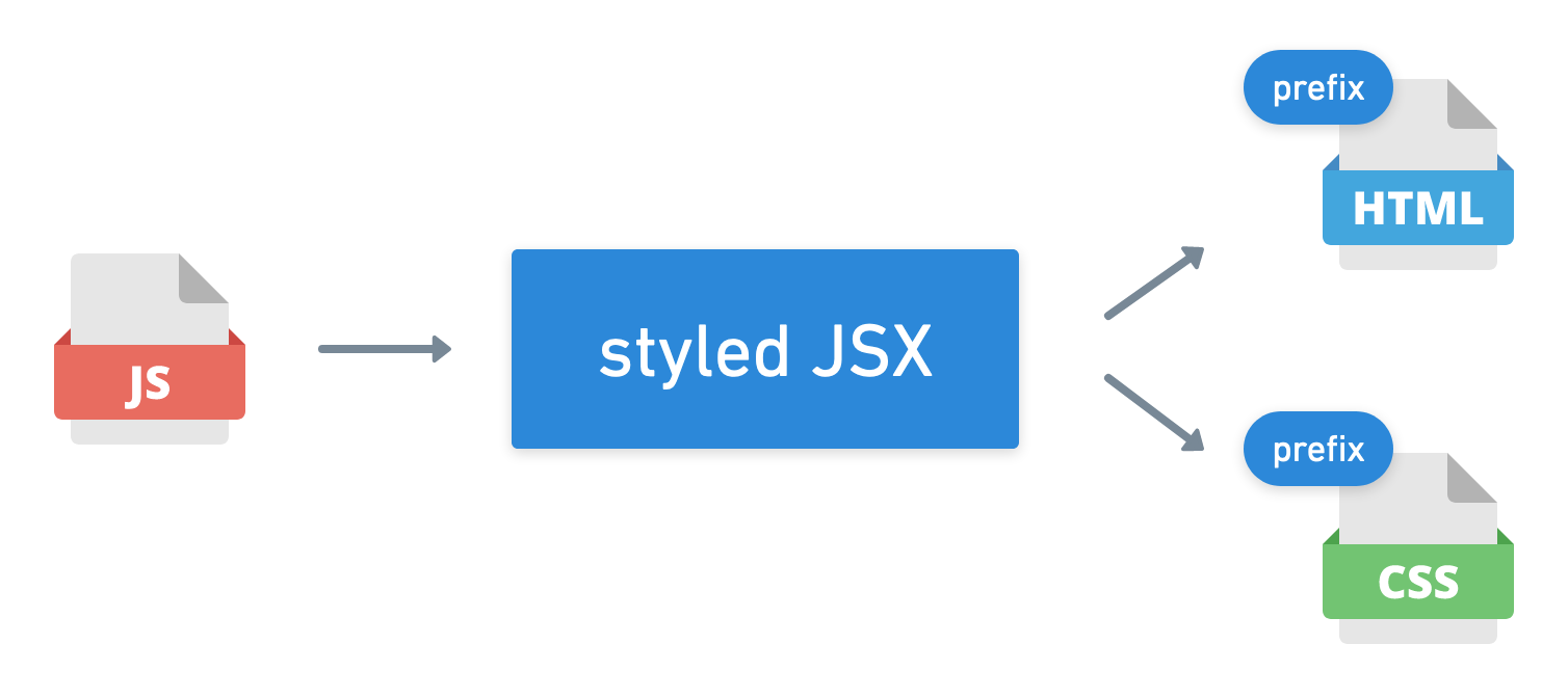
Even though there are plenty of options for CSS pre processors1 and libraries already, the team behind Next.js also made their own library to enhance CSS. This library is called styled-jsx and is included in – and recommended for – Next.js. You can use “styled-jsx” without Next.js, as it plays nicely with babel2.
Styled JSX tries to achieve similar things to styled components in the way that it allows you to embed CSS code for a specific component into your React component’s module/file.
This enables you to write CSS code for a special component, without having to worry about accidentally causing code changes for other components or elements on the page. Once a project reaches a certain size and by that a certain amount of CSS code, it often becomes very hard to manage the CSS and the ways in which CSS code that is meant to only affect one component, actually affects more than you intended. Styled components and styled JSX are addressing this problem.
Component bound styles
Let’s look at an example of how this works. Let’s say you write a React component and what to add some CSS styling, without using any of the more advanced solutions.
What you would do is to create a component, add a className attribute and use this class name in your CSS file. Here is a simple example of the Javascript and CSS code:
function BlueHeadline(props) {
    return (
        <div className="blue-headline">
            <h1>{props.children}</h1>
        </div>
    );
}
.blue-headline {
    background: blue;
}
This works pretty well, with the exceptions that you have to remember the class name and you must ensure that you are not accidentally re-using the same blue-headline class name anywhere else. Finding that .blue-headline in your CSS file can be pretty hard, once your CSS code reaches a few thousand lines.
In styled-jsx you would do something very similar, except that you let the library handle most of the heavy lifting. You can go ahead and use a special style tag and put your CSS code right into your component. The library will automatically generate a random class name, and attach it to the HTML and CSS code.
Here is an example:
function RedHeadline(props) {
    return (
        <div>
            <h1>{props.children}</h1>
            <style jsx>{`
                h1 {
                    background: red;
                }
            `}</style>
        </div>
    );
}
This code defines a very similar component like the one we used before, called RedHeadline. The CSS code is embedded directly into the main element returned by the function. The CSS code itself is “normal” CSS code, which is great because you don’t have to learn any new syntax, except for the new <style jsx> tag.
This code will be automatically compiled into code that looks like this:
<div class="jsx-3507036296">
    <h1 class="jsx-3507036296">Hello</h1>
</div>
The generated CSS will look somewhat like this:
h1.jsx-3507036296 {
    background: red;
}
The benefit here is, that you can always be certain, that code that is meant for one component, will always only apply to one component.
Global styles
If you really want to add code that is supposed to be applied globally (meaning: it should not be prefixed with a random class name), you can also do that by adding a global styled-jsx element.
Let’s say you want to add code that adds an underline to all H1 elements (not only the ones in the BlueHeadline or RedHeadline component), you can do that by adding this code:
<style jsx global>{`
    h1 {
        text-decoration: underline;
    }
`}</style>
This “global” CSS code will not be prefixed or modified, but just added to the compiled CSS output. This is very useful to make general CSS statements like body background colors, or a CSS reset3
CSS modules
A great alternative to styled-jsx are CSS modules. This library is able to achieve basically the same isolation of your CSS code in order to prevent a big mess of unmaintainable CSS code in big projects. They also achieve this by adding magic CSS classes in the compile step, to ensure that no component’s CSS code will override another component’s code.
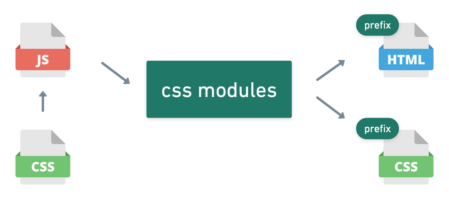
The way they achieve this is quite different from the styled-jsx or even styled components approach. Their approach is to write CSS code into a “normal” CSS file, as you would normally do in any project. An example could look like this:
.green {
    background: green;
}
In your component, you would “just” import this file using the standard import module loader syntax, and use assign the element you want to style with the className of the css class in your CSS module. What might sound hard to grasp in text, becomes quite clear in code, I think:
import styles from "../public/style.module.css";

function GreenHeadline(props) {
    return <h1 className={styles.green}>{props.children}</h1>;
}
The system will then compile this code into something like this:
<h1 class="style_green__2pVr_">Hello</h1>
with the CSS code looking like this:
.style_green__2pVr_ {
    background: green;
}
So the output is very very similar, while the approach between style-jsx and css modules is quite different: While styled-jsx tries to include the CSS code into the code of your component, css modules tries to stay closer to what developers are already used to while still trying to help with accidentally overriding CSS rules.
Both approaches are super useful and luckily Next.js supports both out of the box.
Recap
To summarize, Next.js allows you to basically to whatever you want it to about static files and your CSS code. If you want to opt into one of the more advanced CSS pre processors1, Next.js will be happy to assist you with those.
The two build in options are styled-jsx, which is the library that the great people behind Next.js build themselves. It is a very viable option to organize your CSS code, especially in a bigger project. An alternative to this is CSS modules, which will allow you to achieve the same goals, but staying a little closer to what developers already know to use.
There is nothing from stopping you to use even different systems, like styled components, or whatever comes your way.
Thank you for reading this article. I hope it has taught you a little bit about modern CSS approaches and how to use them in your Next.js project. Let me know which one you prefer via Twitter.
-
CSS is very limited in certain ways, so that many developers try to come up with their own way to write an “enhanced” CSS. This “enhanced” CSS will then be translated into CSS that the browser can understand by a CSS pre processor. There are plenty of choices, but all of them somehow revolve around the idea of adding functionality to CSS. Some classic ones are LESS, SASS and stylus. In more recent years, more advanced CSS pre processors became popular, who integrate a lot more directly into the React.js or Vue.js ecosystem. One of the most common one is called styled components. ↩ ↩2 ↩3
-
Babel is a compiler, that turns modern Javascript code that has all the latest bells and whistles and turns it into code that even older browsers can run. It is the de facto standard to compile your modern ES2015… code. ↩
-
Every browser comes with a predefined list of CSS properties, that are defined by the wonderful people who build your browser. Usually, these predefined properties are about margins, paddings and borders. When we design our website, we probably have our own opinions about margins, paddings and borders, which is why we want to define our own values for those. It is quite common to have a few CSS statements, that reset the browsers’ standard behavior, so that we can be certain that all properties are adhering to our own taste. Back in the day, when browsers where pretty terrible when it came to those defaults, it was fashionable to use a CSS reset that somebody already prepared. One of the more famous ones was Eric Meyer’s CSS reset. ↩
This website does not use any tracking or feedback mechanism. Instead, I would love for you to get in touch with me to let me know if you liked it or if you have any suggestions or questions.